Simple ML Algorithms
Evaluating Simple ML models on spam and zip benchmark datasets.
Introduction
This project involves evaluating different machine learning models using the K-Nearest Neighbors (KNN) and Logistic Regression algorithms. The evaluation is performed on two datasets: handwritten digits (ZIP) and email spam classification (SPAM).
Data Preparation
Two datasets are loaded into pandas dataframes from compressed files. The ZIP dataset is filtered to include only the digits 0 and 1, while the SPAM dataset is used as is.
import pandas as pd
from sklearn.model_selection import GridSearchCV, KFold
from sklearn.neighbors import KNeighborsClassifier
from sklearn.linear_model import LogisticRegression
from sklearn.preprocessing import StandardScaler
from sklearn.pipeline import make_pipeline
from sklearn.metrics import plot_roc_curve
import matplotlib.pyplot as plt
import plotnine as p9

# Read the zip file into a pandas dataframe
zip_df = pd.read_csv(
    "./data/zip.test.gz",
    header=None,
    sep=" ")

print(zip_df.shape)

is01 = zip_df[0].isin([0, 1])
zip01_df = zip_df.loc[is01, :]

# Read the spam.csv data into a pandas dataframe
spam_df = pd.read_csv(
    "./data/spam.data",
    sep=" ",
    header=None)

data_dict = {
    "zip": (zip01_df.loc[:, 1:].to_numpy(), zip01_df[0]),
    "spam": (spam_df.iloc[:, :-1].to_numpy(), spam_df.iloc[:, -1])
}
Model Training and Evaluation
A dictionary data_dict is created to store the input matrices and output vectors for both datasets. A K-Fold cross-validation approach is used to split the data into training and testing sets.
For each dataset:
- A
GridSearchCVobject is instantiated with a KNN classifier to find the best number of neighbors (n_neighbors) from 1 to 20. - A pipeline is created with
StandardScalerandLogisticRegressionto standardize the data and apply logistic regression. - Plots are generated using
plotnine(p9) to visualize the mean test scores as a function ofn_neighbors. - ROC curves are plotted for both models to evaluate their performance.
test_acc_df_list = []
for data_set, (input_mat, output_vec) in data_dict.items():
    kf = KFold(n_splits=3, shuffle=True, random_state=1)
    for fold_id, indices in enumerate(kf.split(input_mat)):
        print("fold_id = " + str(fold_id))
        index_dict = dict(zip(["train", "test"], indices))
        param_dicts = [{'n_neighbors': [x]} for x in range(1, 21)]

        clf = GridSearchCV(estimator=KNeighborsClassifier(),
                           param_grid=param_dicts, cv=5)
        set_data_dict = {}
        for set_name, index_vec in index_dict.items():
            set_data_dict[set_name] = {
                "X": input_mat[index_vec],
                "y": output_vec.iloc[index_vec]
            }
        clf.fit(**set_data_dict["train"])

        print("best params = " + str(clf.best_params_))

        pipe = make_pipeline(
            StandardScaler(), LogisticRegression(max_iter=1000))
        pipe.fit(**set_data_dict["train"])

        pred_dict = {
            "nearest_neighbors": clf.predict(set_data_dict["test"]["X"]),
            "linear_model": pipe.predict(set_data_dict["test"]["X"]),
            "featureless": set_data_dict["train"]["y"].value_counts().idxmax()
        }
        for algorithm, pred_vec in pred_dict.items():
            test_acc_dict = {
                "test_accuracy_percent": (
                    pred_vec == set_data_dict["test"]["y"]).mean()*100,
                "data_set": data_set,
                "fold_id": fold_id,
                "algorithm": algorithm
            }
            test_acc_df_list.append(pd.DataFrame(test_acc_dict, index=[0]))

test_acc_df = pd.concat(test_acc_df_list)
Visualization
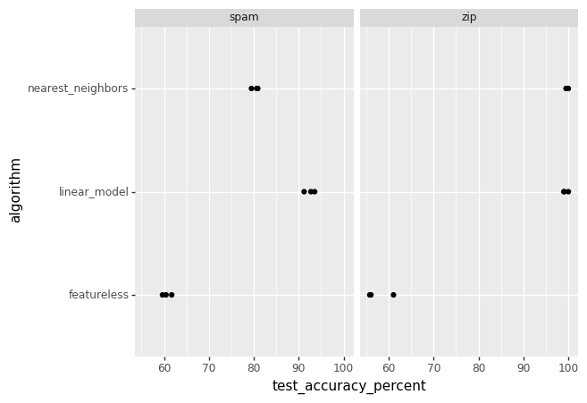
A ggplot is created to visually examine which learning algorithm performs best for each dataset. The plot uses geom_point with test_accuracy_percent on the x-axis, algorithm on the y-axis, and facet_grid to create a panel for each dataset.
gg = p9.ggplot() +\
    p9.geom_point(
        p9.aes(
            x="test_accuracy_percent",
            y="algorithm"
        ),
        data=test_acc_df) +\
    p9.facet_wrap("data_set")
gg.save("p5_accuracy_facetted.png")

Interpretation
The figure above is a scatter plot that visualizes the test accuracy percentages of three different algorithms—nearest neighbors, linear model, and a featureless model—applied to two datasets: spam and zip. Each data point represents the accuracy achieved by an algorithm on a specific dataset.
- Horizontal Axis (test_accuracy_percent): Ranges from 50 to 100, representing the accuracy percentage of the algorithms in predicting the correct outcomes on the test datasets.
- Vertical Axis (algorithm): Lists the three algorithms used in the evaluation: nearest neighbors, linear model, and featureless.
- Data Points: Each algorithm has a corresponding data point for each dataset (spam and zip), indicating the accuracy achieved.
- Spam Dataset: The data points under the ‘spam’ label show the performance of the algorithms on the spam dataset.
- Zip Dataset: Similarly, the data points under the ‘zip’ label show the performance on the zip dataset.
We can deduce the following:
- The nearest neighbors algorithm has varying performance on both datasets, with higher accuracy on one of them.
- The linear model shows a consistent accuracy level across both datasets.
- The featureless model, which likely predicts the most frequent class, has the lowest accuracy, indicating that the other two models have learned patterns from the data.
Conclusion
This type of visualization is crucial for comparing the effectiveness of different machine learning algorithms on various datasets. It helps in identifying which algorithm performs best for a particular type of data and can guide the selection of models for further development or deployment. The clear separation of data points by dataset also allows for a quick assessment of how each algorithm might generalize to different types of data. The project provides a clear comparison of the model performances across different datasets.