Microbiome Network Analysis
Graphs that represent the complex microbiome association network.

Overview
Microbiome are the microorganisms that live in a particular environment, such as the soil, gut, or water. These organisms form associations or interactions with each other, creating complex networks that can be challenging to analyze. Some of the algorithms which are used to infer the network structure are Correlation-based (Pearson/Spearman), LASSO and Gaussian Graphical Models. In this project, we were interested in analyzing the pairwise relationships between different entities in the microbiome data. Using Pearson correlation as the main algorithm was a logical choice as it fits in this use case and it is widely used in the field of microbiome analysis.
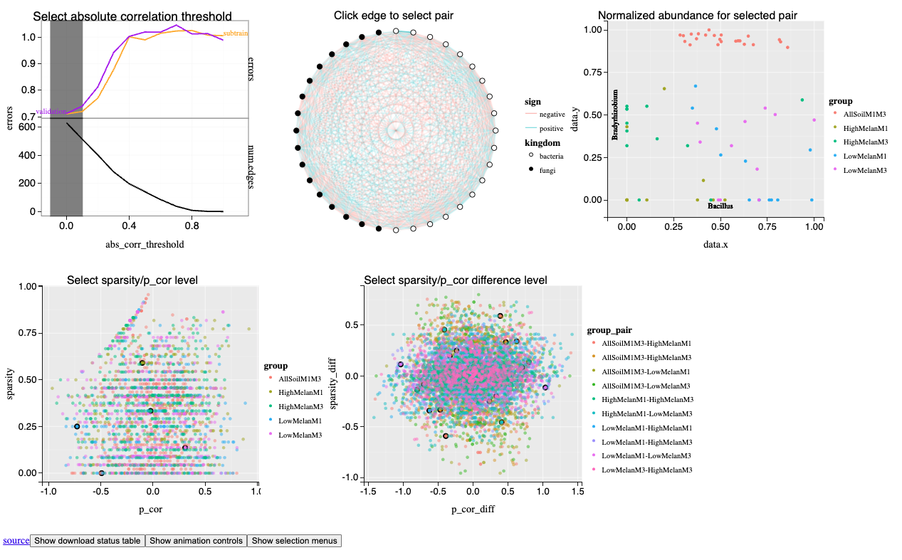
This project involves the creation of a series of interactive plots and graphs necromass-figure-one-network that represent the complex microbiome data from a scientific study. This analysis is done on necromass data from a study in University of Minnesota. Necromass basically refers to the dead organic matter in the soil. The data consists of samples from different conditions (AllSoilM1M3, HighMelanM1, HighMelanM3, LowMelanM1, LowMelanM3), and the visualizations are designed to identify correlations, distributions, and patterns within the dataset. The visualizations provide a clear and concise way to present complex data, making it accessible to a broader audience.
Plots Description
All the five plots are linked to each other and provide a comprehensive view of the data.
-
Select Absolute Correlation Threshold: This plot shows the relationship between different correlation thresholds and the number of edges, helping to determine the strength of the connections in the data. It has the subtrain and validation error and the number of edges in the network against the absolute correlation threshold. In ML, subtrain error is the error on the subtrain data and validation error is the error on the validation data. The number of edges in the network is the number of connections between the entities in the data. To filter out the spurious correlations, we can set a threshold on the absolute value of the correlation coefficient. This plot helps in selecting the optimal threshold for the network. This corresponds to the number of edges where the validation error is minimum.
-
Click Edge to Select Pair: An interactive network diagram that allows users to explore the connections between different entities. When an edge is clicked, the corresponding pair of entities is selected, and the data for that pair is displayed in the other plots. This plot helps in understanding the relationship between different entities in the data.
-
Normalized Abundance for Selected Pair: A scatter plot that displays the abundance of two variables over time, providing insights into their behavior and relationship. This plot helps in understanding the distribution of data points for the selected pair of entities. The x-axis represents the abundance of the first entity, and the y-axis represents the abundance of the second entity. I use log transformation and min-max scaling to normalize the data.
-
Select Sparsity or Pearson Correlation Level: This plot shows the sparsity of the network at different correlation levels, helping to identify the optimal level for analysis. You can select the sparsity level or the Pearson correlation level to see the corresponding network. This plot helps in understanding the sparsity of the network at different correlation levels.
-
Select Sparsity Difference Level or Pearson Correlation Difference Level: Similar to the third plot but with more data points, offering a detailed view of the sparsity in relation to the correlation difference. This plot helps in understanding the relationship between the sparsity of the network and the difference in the correlation levels. The x-axis represents the difference in the correlation levels, and the y-axis represents the difference in sparsity levels of the network.
Methodology
The data was analyzed using statistical and computational techniques to extract meaningful patterns. The plots were generated using data visualization tools and libraries that support the rendering of scientific data.
Importance
The visualizations provide a clear and concise way to present complex data, making it accessible to a broader audience. They are essential for:
- Communicating findings effectively in scientific research.
- Assisting in decision-making processes by revealing hidden trends.
- Facilitating peer review and collaborative efforts by providing a common visual language.
Conclusion
The project showcases the power of data visualization in interpreting large datasets and emphasizes the need for effective communication in the field of data science.